Why Your Watercolours Look Muddy?
How to get vibrant colours every time!
WATERCOLOUR
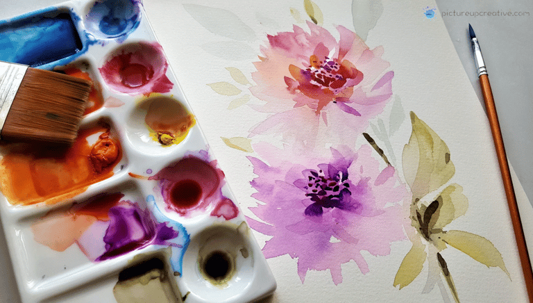
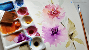
1. Too Many Colours Mixed Together
Watercolour is all about transparency. The more pigments you layer or mix, the less light shines through. When too many different pigments are combined, they cancel each other out, creating that dreaded “mud.”
👉 Tip: Stick to mixing 2 colours, maybe 3 at most.
2. Choosing the Wrong Pigments
Not all paints behave the same. Some are naturally opaque or granulating, and when you mix them a lot, things can get chalky fast.
👉 Take a little time to learn which of your paints are transparent. Those usually give you the best bright, clear mixes.

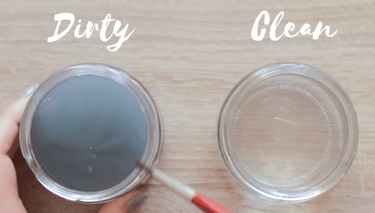
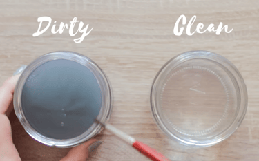
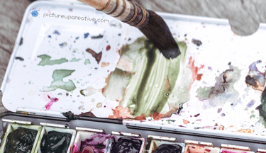
3. Dirty Water (or Brush!)
Sounds obvious, right? But if your rinse water is murky, every dip dulls your paint.
Same goes if your brush still has leftover colour on it.
👉 Keep two jars of water on hand — one for rinsing, one with clean water. It really helps.
4. Painting on damp Layers
If you rush and paint on top of a damp layer, the colours can mix together in messy, uncontrolled ways… and that’s when the dreaded mud shows up.
👉 Be patient (I know, it’s hard!) and let each layer dry before adding another.
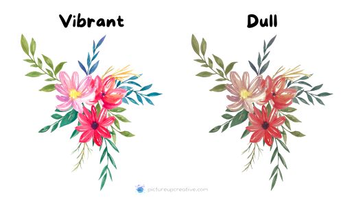
✨ And here’s the thing: “mud” isn’t always the enemy. Neutral tones can actually bring balance, depth, and softness to a painting. The trick is using them on purpose, not by accident.
✨ Watercolour shines when you give it space to breathe — with clean mixes, good paper, lighter brushstrokes and a little bit of patience.
✨ Once you spot these little habits and adjust them, you’ll notice your colours instantly look cleaner, fresher, and more alive.The more you practice, the more your paintings will glow. So don’t get discouraged.
We’ve all had muddy paintings (I still do sometimes!). It’s just part of the learning journey. 🌼🌺
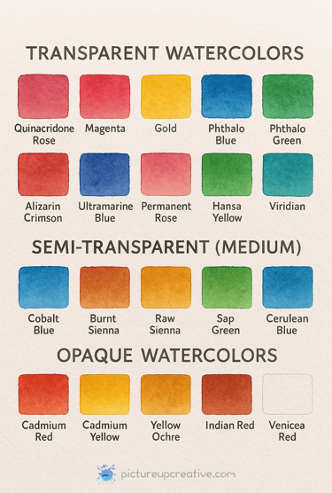
🌟 Transparent Watercolours
These are your glow-makers. They layer beautifully, mix cleanly, and give that luminous, “glowing from the paper” look.
Common transparent pigments:
Quinacridones (Quinacridone Rose, Magenta, Gold)
Phthalos (Phthalo Blue, Phthalo Green)
Alizarin Crimson (permanent versions)
Ultramarine Blue
Permanent Rose
Hansa Yellow (Lemon, Light)
Viridian
👉 These are great for glazing and mixing — they keep colours bright and fresh.
🎨 Semi-Transparent (Medium)
These sit in the middle — a little glow, a little body. They can be lovely for softer mixes and layering.
Examples:
Cobalt Blue
Burnt Sienna
Raw Sienna
Sap Green
Cerulean Blue
🪨 Opaque Watercolours
These are the chalkier, heavier colours. They don’t let much light through, so they can dull mixes if you’re not careful. But they’re fantastic when you want solid coverage or softness.
Common opaque pigments:
Cadmiums (Cadmium Red, Cadmium Yellow)
Yellow Ochre
Indian Red
Venetian Red
Cerulean (depending on brand, often semi-opaque)
Gouache-style colours (like Chinese White)
👉 Use them sparingly in mixes — or let them shine on their own for contrast.
✨ Quick Tip: Most professional watercolour brands (like Daniel Smith, Winsor & Newton, Schmincke, etc.) print the transparency rating right on the tube or in their colour charts. That’s the easiest way to check!

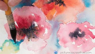
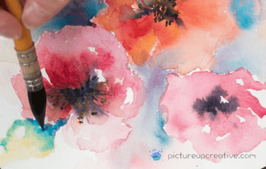
Have you ever sat down with your beautiful watercolour palette, picked those gorgeous vibrant colours… only to end up with a painting that looks dull, flat, or even a bit chalky? You’re not alone. Almost every watercolour artist—beginner or experienced—has gone through the “mud stage.”
✨ The good news: it’s not because you’re a bad painter or don’t have talent. With just a few tips and tricks, you can keep your colours looking bright, fresh, and glowing.
5. Overworking the Paper
We all do this — going back over the same spot again and again because it doesn’t look “right.” But what happens is the paper gets rough, pigment lifts, and suddenly the glow disappears.
👉 Lay your wash, let it dry, and walk away. You can always come back later with a fresh layer.
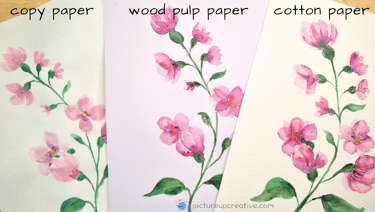
6. Cheap Paper
This one is sneaky. If you’re using cheap or student-grade paper, the paint doesn’t sit on the surface properly — it just soaks straight in and leaves your colours looking lifeless. Honestly, it’s not you, it’s the paper.
👉 If you can, invest in 100% cotton watercolour paper. It makes a huge difference.

Enjoy the process and happy painting!

Join me on a journey of creativity!
We won't send you spam. Unsubscribe at any time.
Subscribe for monthly newsletter,
inspiration and tips & tricks for your art journey!
Gift for you, a FREE
Watercolour Practice Sheet & Supply Guide!


🎨 You Might Also Like…