Easy Colour Theory for Beginners
All you need to know!
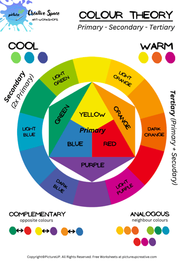
COLOUR THEORY
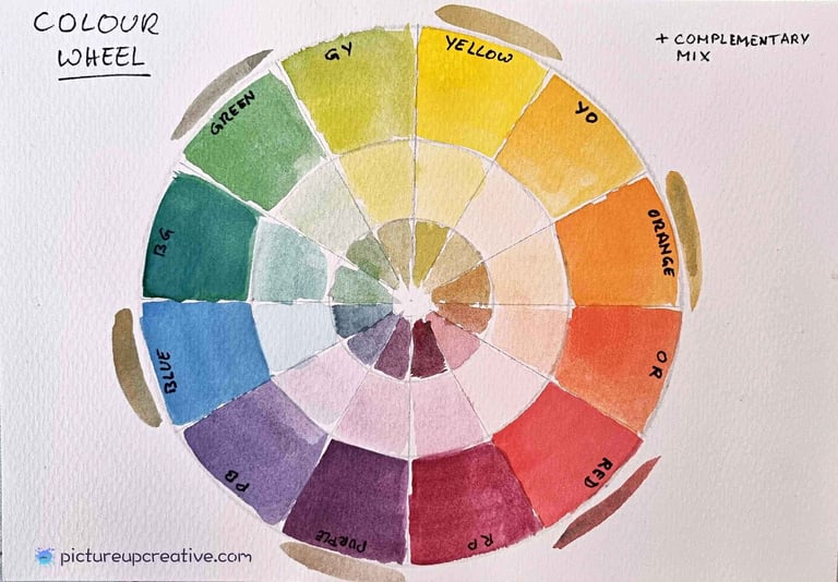
🌈 The Colour Wheel — Your Map
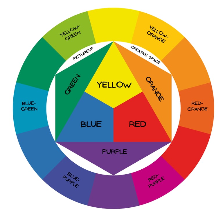
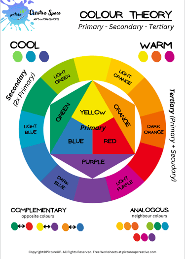
Think of the colour wheel as your painting compass. It’s a circle showing the relationships between colours.
Primary colours: Red, Yellow, Blue. These can’t be mixed from anything else.
Secondary colours: Orange, Green, Purple. These come from mixing two primaries.
Tertiary colours: Mix a primary with a secondary, and you get colours like red-orange or blue-green.
👉 Tip: Keep a little colour wheel or make your own swatches — it’s a great visual tool while painting.
FREE GIFT: download at the end of this blog.
🎨 Warm vs. Cool Colours
Warm colours (reds, oranges, yellows) feel sunny, energetic, and forward.
Cool colours (blues, greens, purples) feel calm, soothing, and recede into the background.
👉 Try it: Paint a flower in warm colours and a background in cool colours — the flower will pop!
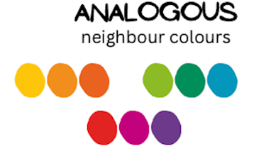
🎶 Analogous Colours
These are neighbours on the colour wheel (like blue, blue-green, and green).
They blend beautifully and feel harmonious.
Great for soft, natural looks (think landscapes, skies, leaves).
👉 Tip: Use analogous colours when you want calm and flow.
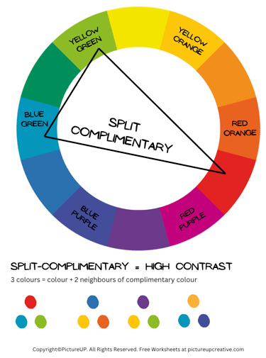
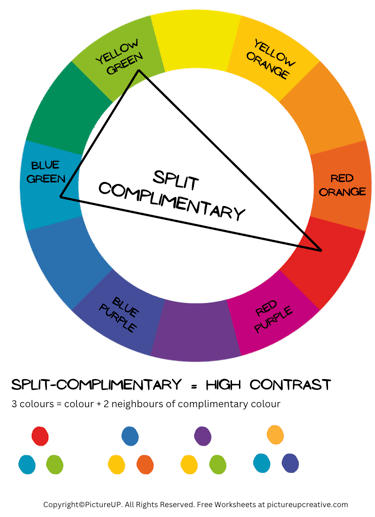
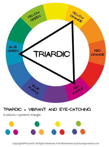
Split Complementary & Triads (A Bit Fancy, But Fun)
Split complementary: Take one colour, then use the two colours beside its opposite. (E.g. blue + yellow-orange + red-orange). It’s colourful but balanced.
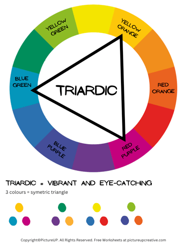
Triadic: Three colours evenly spaced around the wheel (red + yellow + blue). Bright and dynamic!
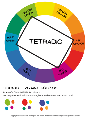
Tetradic: Two pairs of complementary colours - four in total. (red + green and blue + orange).
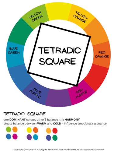
Very colourful and rich. Best if you let one colour dominate and use the others as accents.Tetradic Square: Four colours evenly spaced around the wheel (red, yellow-green, blue, and violet).
Super balanced. Great when you want variety but still harmony.
👉 You don’t need to use these all the time — just nice to know when you want to shake things up.
✨ Easy Tips to Use Colour Theory in Watercolour
Limit your palette — fewer colours = fresher mixes.
Use warm colours to bring things forward, cool to push them back.
Remember opposites: side by side = vibrant, mixed = neutral.
Practice by making a mini colour wheel with your own paints.
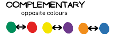
💡 Complementary Colours
These are colours that sit opposite each other on the wheel
(like red + green, blue + orange, yellow + purple).
They create high contrast when placed side by side.
They also neutralise each other (make browns/greys) when mixed.
👉 Use them for balance: a splash of complementary colour adds instant vibrancy.


Colour theory might sound a little intimidating at first (like something you’d learn in art school), but don’t worry — it’s actually really simple once you see it in action.
And the best part? Knowing just a few basics will instantly make your paintings look more balanced, vibrant, and intentional.
So, let’s break it down...
🌸 Value & Saturation (The Secret Sauce)
Colour isn’t just about which hue you pick — it’s also about how light, dark, or intense it is.
Value: Light vs. Dark. Adding water in watercolour makes colours lighter.
Saturation: Bright vs. Muted. Mix a touch of the opposite colour to tone things down.
👉 A painting with variety in values (lights, mediums, darks) looks more dynamic and less flat.


🌼 Final Thought
Colour theory isn’t about rules — it’s about giving you tools to make painting easier and more fun. Once you get the hang of the basics, you’ll start to see colour differently, and your paintings will instantly feel more alive.
Freebies
🎨 Don’t just read about colour theory — play with it! Download your free colour wheel and keep it handy next time you paint. You’ll be amazed how much easier it is to choose colours. 🌈
Colour Theory:
all about the basic colour theory
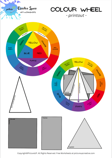
Colour Wheel:
free cut-out printable
Join me on a journey of creativity!
We won't send you spam. Unsubscribe at any time.
Subscribe for monthly newsletter,
inspiration and tips & tricks for your art journey!
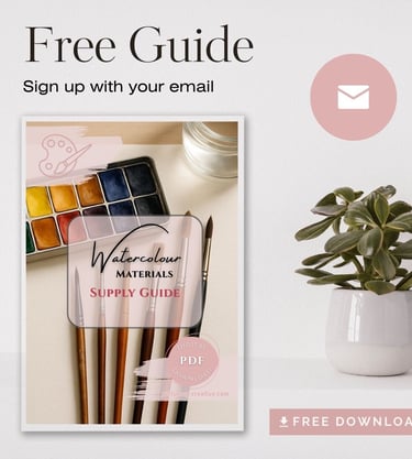
Gift for you, a FREE Watercolour Supply Guide!
🎨 You Might Also Like…